Natural Light Impact on Color and Style in Home Design
Have you ever walked into a store and found the perfect accessory for your home and then, when you got home, that piece looked blah? Or have you looked at a photo taken inside your kitchen and noticed that your carefully chosen cabinet color just doesn’t look the same?
Well, if you answered yes, you are definitely not alone. It happens to everybody. There’s no one to blame, really – it’s just a matter of understanding that colors can look very different due to a number of factors, especially the amount and quality of light involved.
Bulb Types
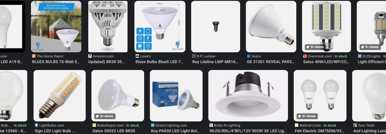
There was a time when we all bought one kind of light bulb – incandescent bulbs – and we simply chose varying wattages to control for brightness. For many of us, our eyes and brains have decades of familiarity with this kind of lighting. It blended well with whatever natural light worked its way into a room, and we really didn’t think too much about it, frankly.
Fast forward to today… you may have noticed that we’ve survived a bit of a complicated Renaissance of lighting evolution in our own homes. Halogens and CFLs (those coily “compact fluorescent lamps” that fit into the same incandescent light sockets) gave us new options and then, more recently, highly efficient LEDs have completely taken over. And those early LEDs that were billed as lasting 20 years (which of course, they won’t) were different from the LEDs you can buy today. Long story short, there’s a good chance that you’ve got competing qualities of light in the same room, even before you consider whatever natural is coming through the windows and skylights.
So, yes – home decor items and cabinets can look very different from one photo or memory to the next, depending on what time of day it is, which lights are turned on, and what kinds of light bulbs replaced the previous light bulbs.
Natural Light and Color
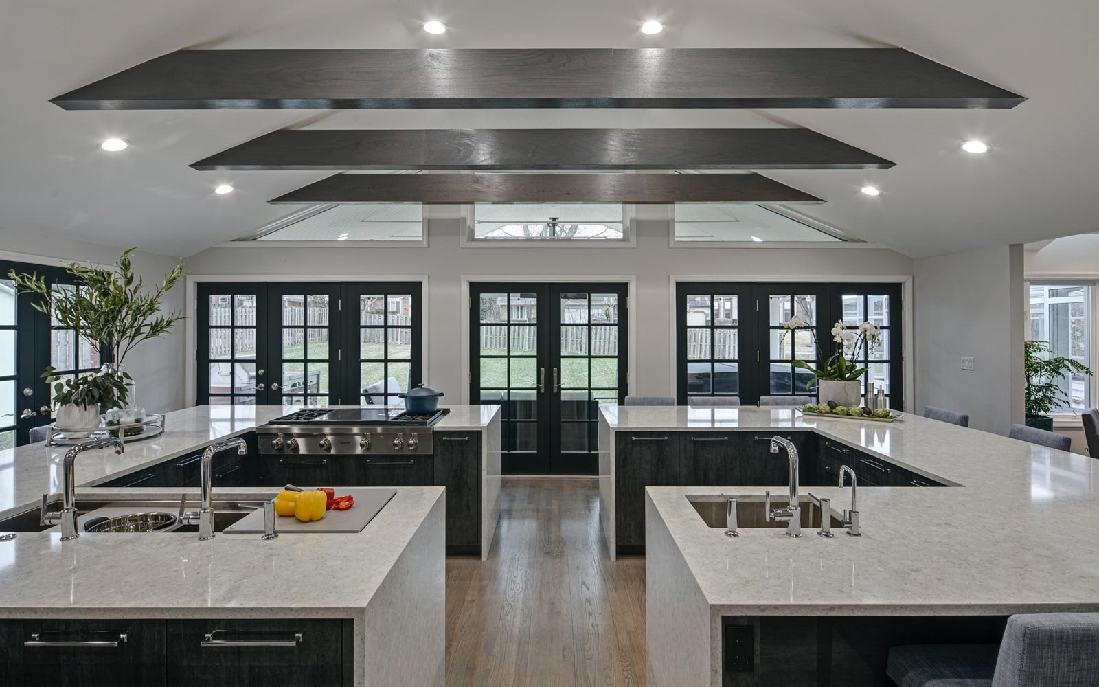
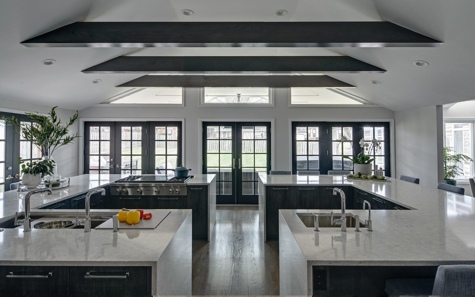
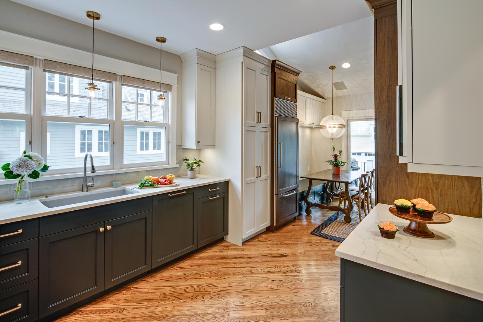
Note how the colors in this kitchen are different when the lights are on or off
The color you see on your walls might appear to be an exact match to the paint color sample… or not! This is what makes design challenging and interesting at the same time. When we agree on the best design style to be used in your kitchen or bathroom remodel, we not only select the cabinetry, lighting, plumbing fixtures, and accessories… we also select an appropriated color scheme based on your goals.
A consideration of natural light makes our design process more intentional. Plus, relying on natural light more is good for the environment as it will help you reduce your energy consumption. Natural light is also beneficial for your health. A lack of sunlight has been directly related to seasonal affective disorder (SAD) which affects 6% of U.S. population, especially those living in areas with long winters and little sunlight.
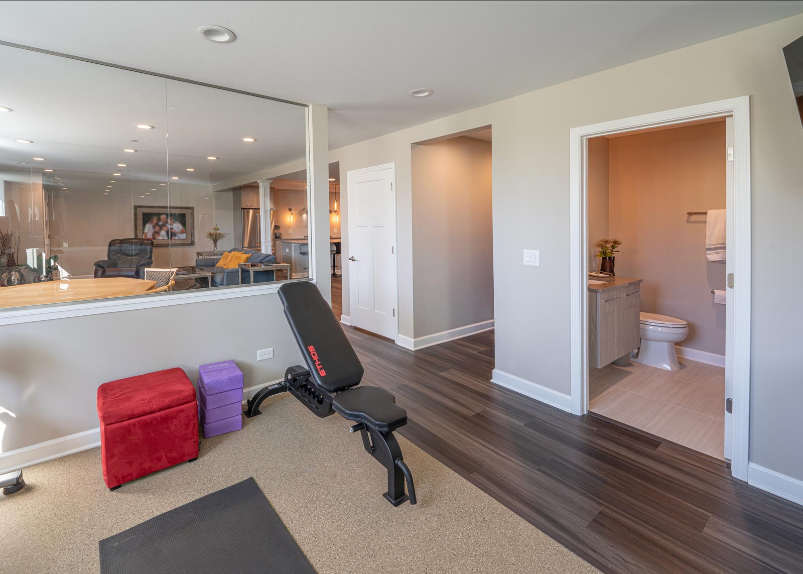
For the most part, the array of colors we choose for your project will reflect and refract a bit differently as the day goes on. Ask any photographer – the position of the sun and the kinds of clouds in the sky go a long way in determining how the colors in your remodeled space appear to both the naked eye and a camera lens. Luckily, today’s smartphones do a lot to evaluate the different kinds of light in a photo and they adjust accordingly. And when your phone’s camera gets it wrong, before sharing a photo you can go to the settings and make corrective adjustments.
You may have noticed that when you buy light bulbs these days, yesteryear’s familiar descriptions of 40, 60 or 100 Watts are hard to find. Look for the fine print and you’ll see explanations of how certain values in lumens are the equivalent of yesteryear’s values of Watts-related brightness. Today, you’re likely to find words like “white,” “cool” and “warm” in prominent type on the packaging. This refers to the different color temperatures various LED bulbs emit, measured in Kelvin. Light bulb manufacturers don’t expect you to remember that 2700 K and 3000 K bulbs give you a warmer, yellower light, while 4000 K and up give you a cooler white that is closer to the natural light we associate with blue skies. Instead, light bulb packaging tends to lead with the words “warmer” and “cooler,” along with yellow-ish and blue and white designs to give you an indication of what you’re buying. It gets complicated when you consider that items lit by bulbs with higher Kelvin temperatures can look unnaturally blue (the color we might associate with coldness) when next to objects lit with lower (warmer) Kelvin temperatures. And temperatures that are even higher (5ooo K and up) eventually reach a completely natural white-ish outdoor kind of light.
Still not clear on what all this means? Well, you’re not alone. Just know that buying all “warm” lower-temperature LED bulbs can make your space look very different than if you buy all “cool” higher-temperature LED bulbs. You might find that your space looks better with the cooler (4000+ K) bulbs when there is simultaneous daylight streaming in through the windows. Or, you might prefer the look of warmer bulbs at night, when there’s no daylight involved. There are a number of light bulb systems on the market, like the Philips Hue system, that allow you to change the color temperature of your bulbs via an app.
Talk with your designer about the feeling you want to create in your kitchen or bathroom and how the use of natural lighting can help.
