Color Trends for 2026
Every year, paint and color companies reveal their Color of the Year picks – and every year, homeowners ask us what it all means for real projects. So we’ve rounded up the 2026 selections (from designer brands, big brands, and more) and put them all in one place. Taken together, they form a calm, grounded palette – think soft whites, nature-inspired greens, warm neutrals, and a few moodier, jewel-like tones for contrast.
Our design team has already been leaning into many of these hues in recent kitchen and bath projects, long before the official announcements. Seeing the industry confirm what we’re hearing and seeing from clients is energizing – and it gives us even more ways to help you choose colors that feel current, livable, and uniquely you.
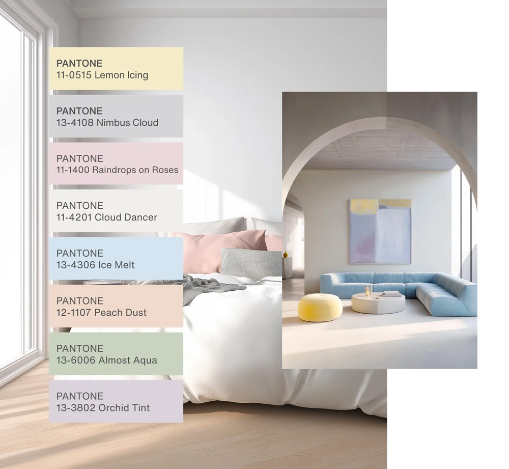
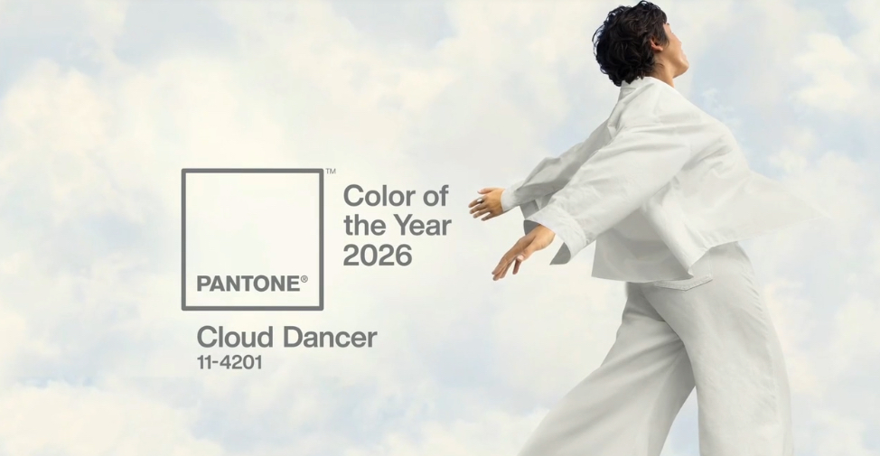
Pantone’s Color of the Year 2026: Cloud Dancer 11-4201
Pantone’s 2026 Color of the Year, Cloud Dancer, enters a lively debate. Different corners of the design industry have declared white kitchens “dead” or “not capable of expiring,” of course. And now here comes Pantone’s ethereal blue-white as a strong argument for white’s timelessness. Yes, it’s a color. And yes, a shade this serene and luminous can absolutely anchor a palette for any living space. At Drury Design, our designers have worked with these expansive, airy neutrals for years. We’re well-versed in using a hue like Cloud Dancer not as a passing trend, but as a foundational tool—a whisper of calm that directs the light, mood, and potential of your entire room.
So, does Pantone know what they’re talking about? Here are their Colors of the Year for 2025, 2024, 2023, 2022 and 2021.
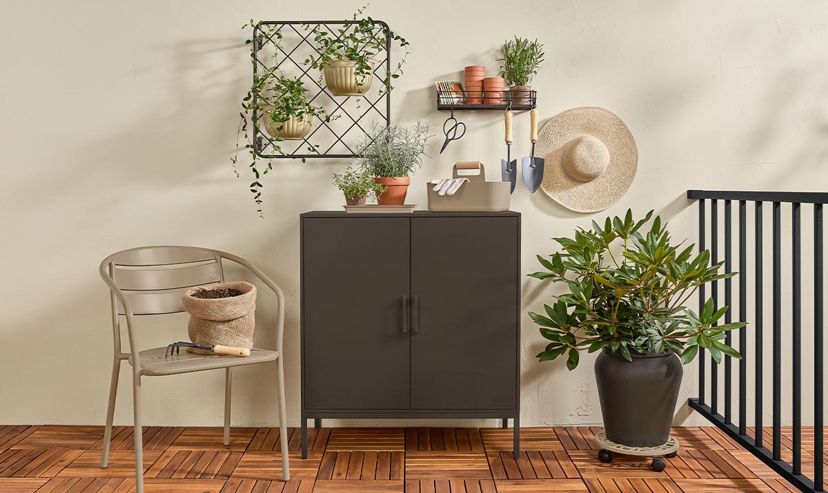
Sherwin-Williams – Universal Khaki SW 6150
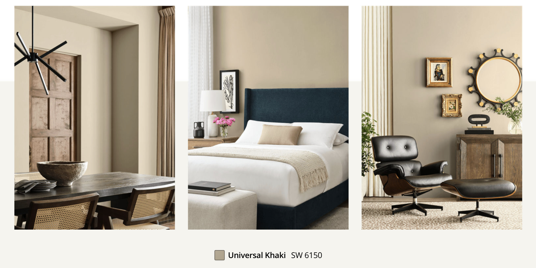
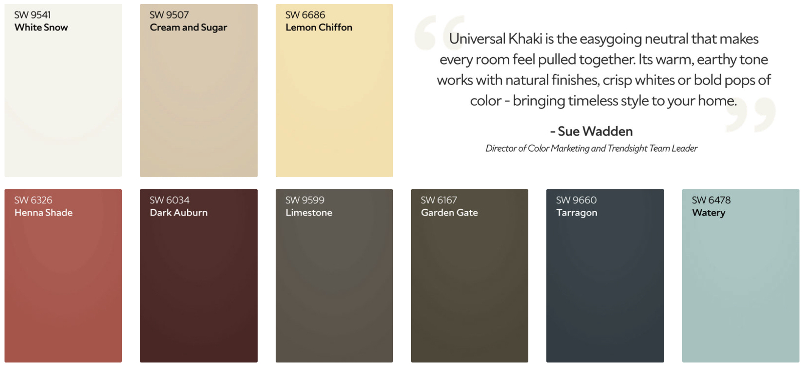
We were honored to recently host Sherwin-Williams reps at our studio for an exclusive preview of their 2026 Color of the Year: Universal Khaki. This color is a warm, grounded neutral that reads as calm and dependable — a true workhorse shade for homeowners who want subtle color without drifting into gray. It sits comfortably between beige and taupe, giving spaces a natural warmth that never competes with surrounding materials.
As the cornerstone of Sherwin-Williams’ 2026 palette, Universal Khaki offers an inviting backdrop for everything from natural woods to rich accent colors. It’s the kind of shade our designers reach for when a room needs quiet cohesion and long-term versatility.
Benjamin – Moore Silhouette AF-655
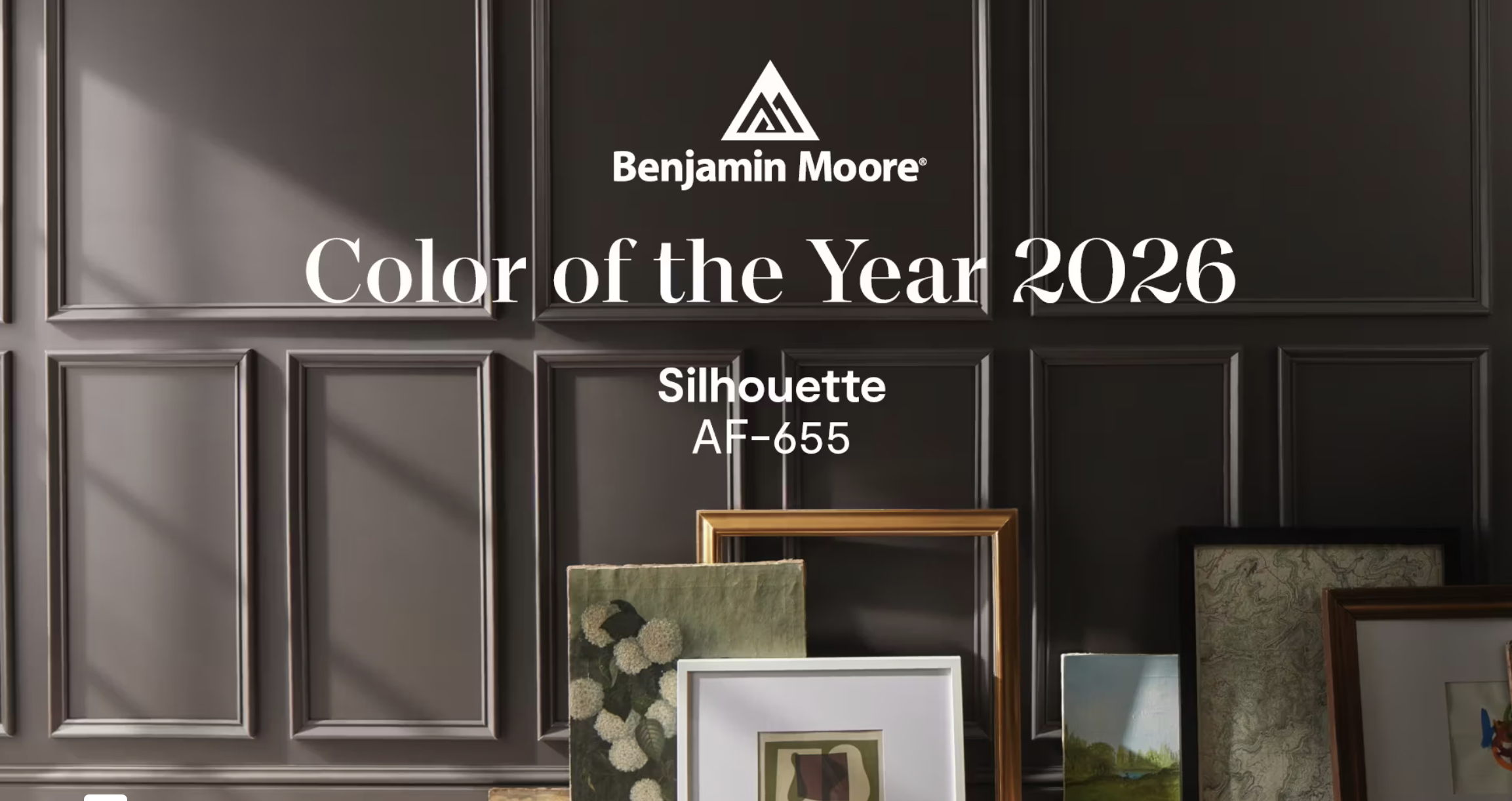
Silhouette AF-655 brings together deep espresso tones and soft charcoal shading, creating a color that feels warm, tailored, and quietly dramatic. It’s a shade that leans into sophistication without feeling formal — the kind of neutral that instantly elevates a room.
As the anchor of Benjamin Moore’s 2026 palette, Silhouette brings balance to both light and dark companions. In kitchens, baths, and built-ins, it adds a sense of intention and depth that pairs beautifully with natural woods, soft whites, and brushed metals.
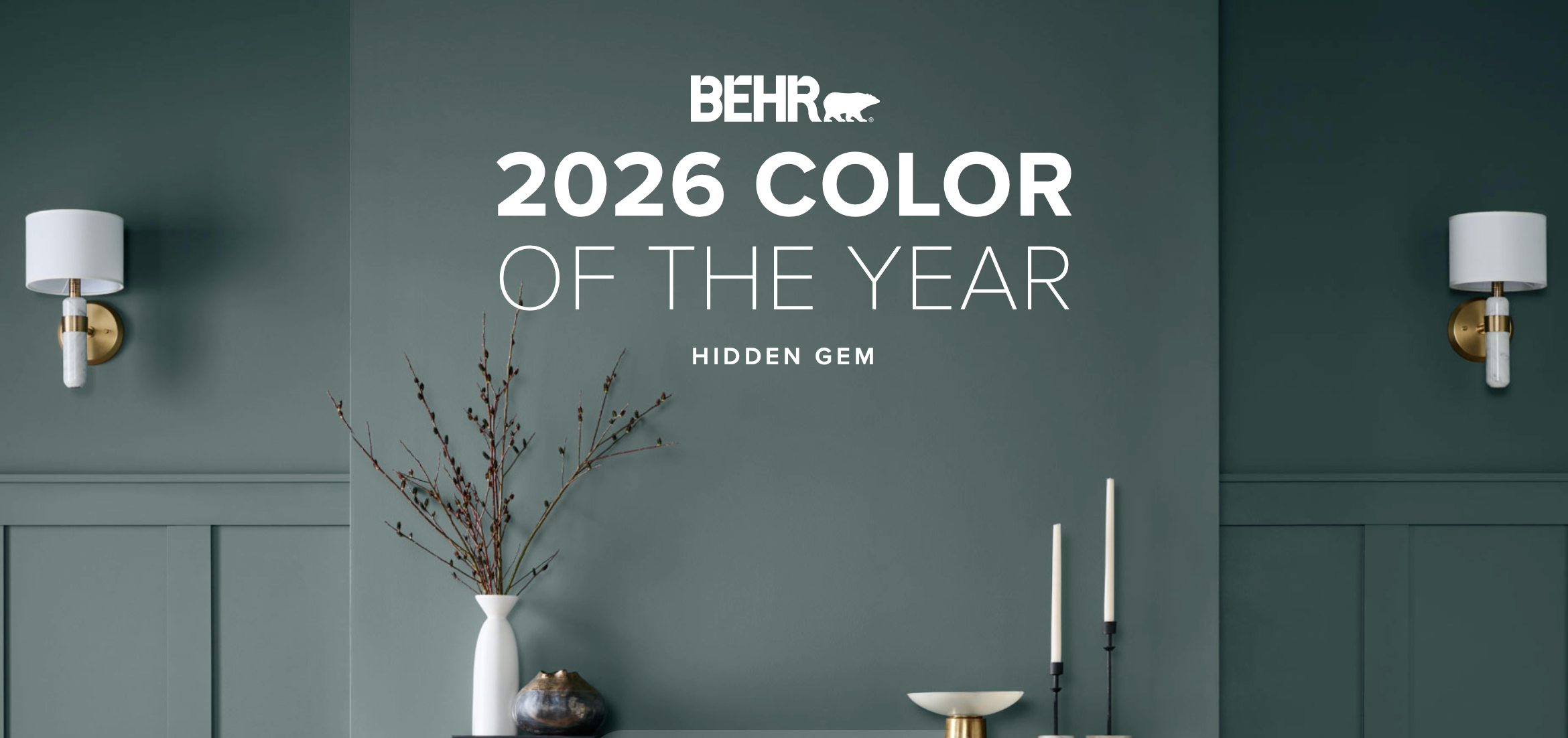
Behr’s 2026 Color of the Year: Hidden Gem N430-6A
Hidden Gem N430-6A is a blue-green with real presence — rich enough to feel dramatic, but softened just enough to stay welcoming. It has that chameleon quality designers love: bold in the morning light, cozy and intimate in the evening.
Behr positions it as a leading hue for expressive interiors, and it works beautifully on cabinetry, accent walls, and powder rooms where you want color that feels both modern and enduring. It’s a great option for homeowners ready to step beyond neutrals without venturing into overly saturated territory.
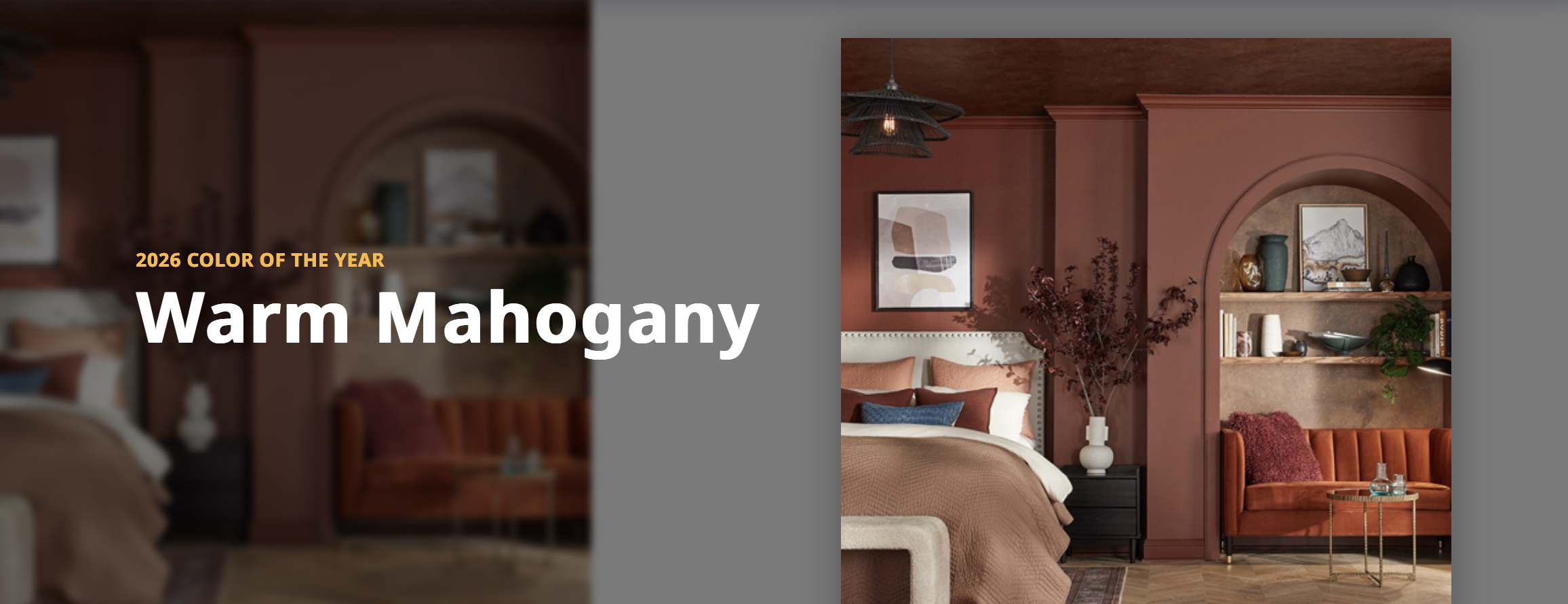
PPG’s 2026 Color of the Year: Warm Mahogany
Warm Mahogany is a deep, comforting brown with subtle red undertones that echo the richness of aged wood. It’s a shade that brings an immediate sense of warmth and grounding to a space — cozy, inviting, and unmistakably classic.
Warm Mahogany works beautifully anywhere you want depth and dimension: as an accent wall, on cabinetry, or in rooms where darker tones help create intimacy. The color leans slightly toward the luxurious side of the spectrum, yet it still feels approachable and versatile, especially when paired with soft neutrals, warm whites, brushed metals, or natural stone.
For homeowners leaning into the “quiet luxury” aesthetic, Warm Mahogany offers a polished, elevated look without feeling formal. It’s a great option for anyone wanting to bring richer, more character-driven tones into their home while still keeping the palette timeless and rooted in natural materials.
C2’s 2026 Color of the Year: Epernay – 639
C2 Paint’s 2026 Color of the Year is Epernay #639, a soft ochre with gentle mineral undertones that evokes sun-warmed stone and the quiet warmth of heritage interiors. It carries a softness and subtle warmth that makes it feel both timeless and fresh — less a statement, more a foundation.
Epernay brings understated elegance to spaces that want character without boldness. Whether used as a wall color, on built-ins, cabinetry, or even exterior trim, it provides a warm, inviting backdrop that complements natural materials like wood, stone, and linen. Paired with white trim, warm metals, or softly contrasting accent hues — dusty greens, muted blues, or deep charcoals — it gives rooms a grounded, approachable sophistication.
For homeowners drawn to a “slow-living,” quietly refined aesthetic, Epernay offers a versatile neutral that feels rooted in tradition yet sensitive to modern living. It’s a great choice when you want a sense of history and craftsmanship without dominating the space.
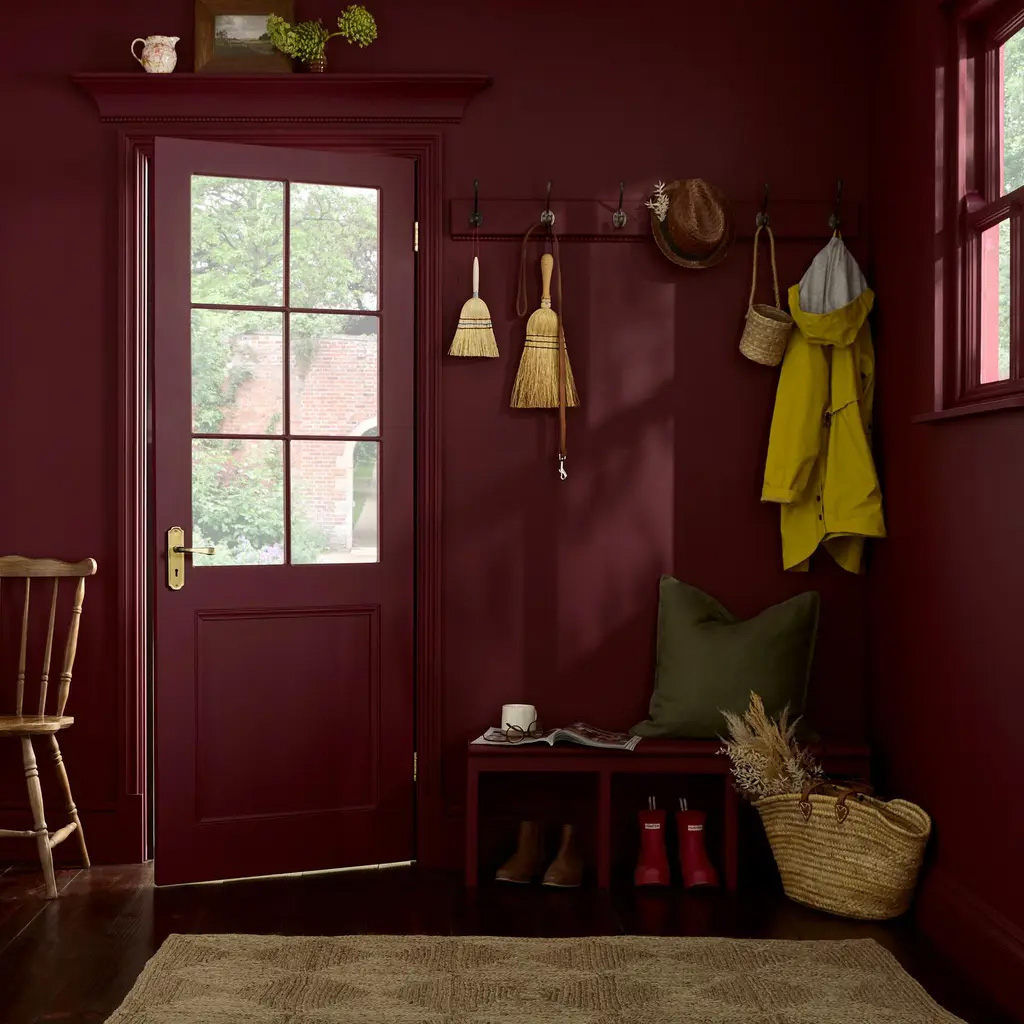
Graham & Brown’s 2026 Color of the Year: Divine Damson
A perfect deep damson shade, the British company’s Color of the Year 2026 is a timeless and versatile color that suits a variety of styles and environments. The dark damson color evokes a sense of elegance, luxury and sophistication.
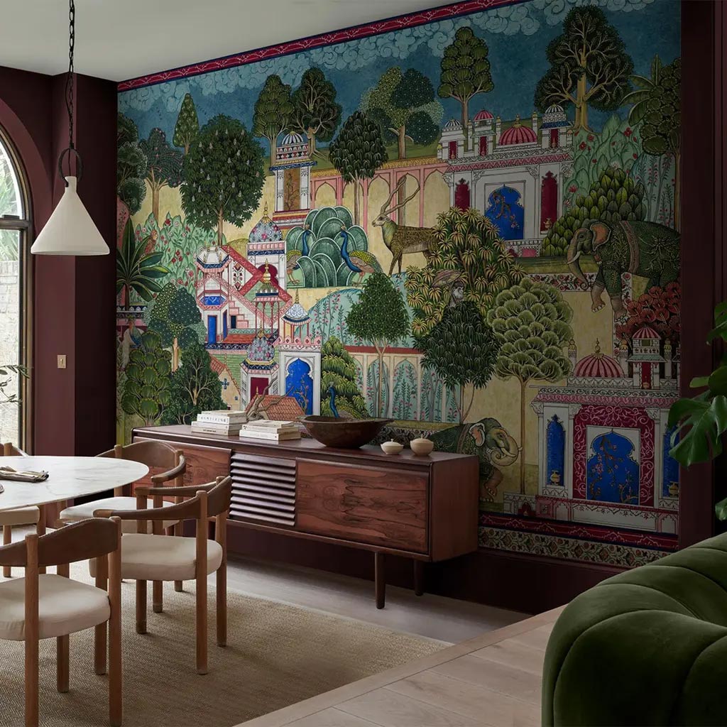
Divine Damson complements the company’s 2026 Mural of the Year “Eternal City.”
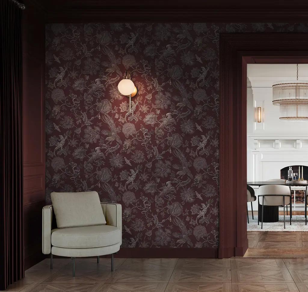
Divine Damson is a key element in “Eternal Weave,” a wallpaper the company announced as its Design of the Year for 2026, which is also available in five other variations. This magical and whimsical design is heavily influenced by nature, mythology and the craftsmanship of the designs that come to life through texture, color and storytelling. This detailed and intricate work of art features tropical flowers, plants, birds and reptiles in jewel colors to bring this exotic and captivating design to life.
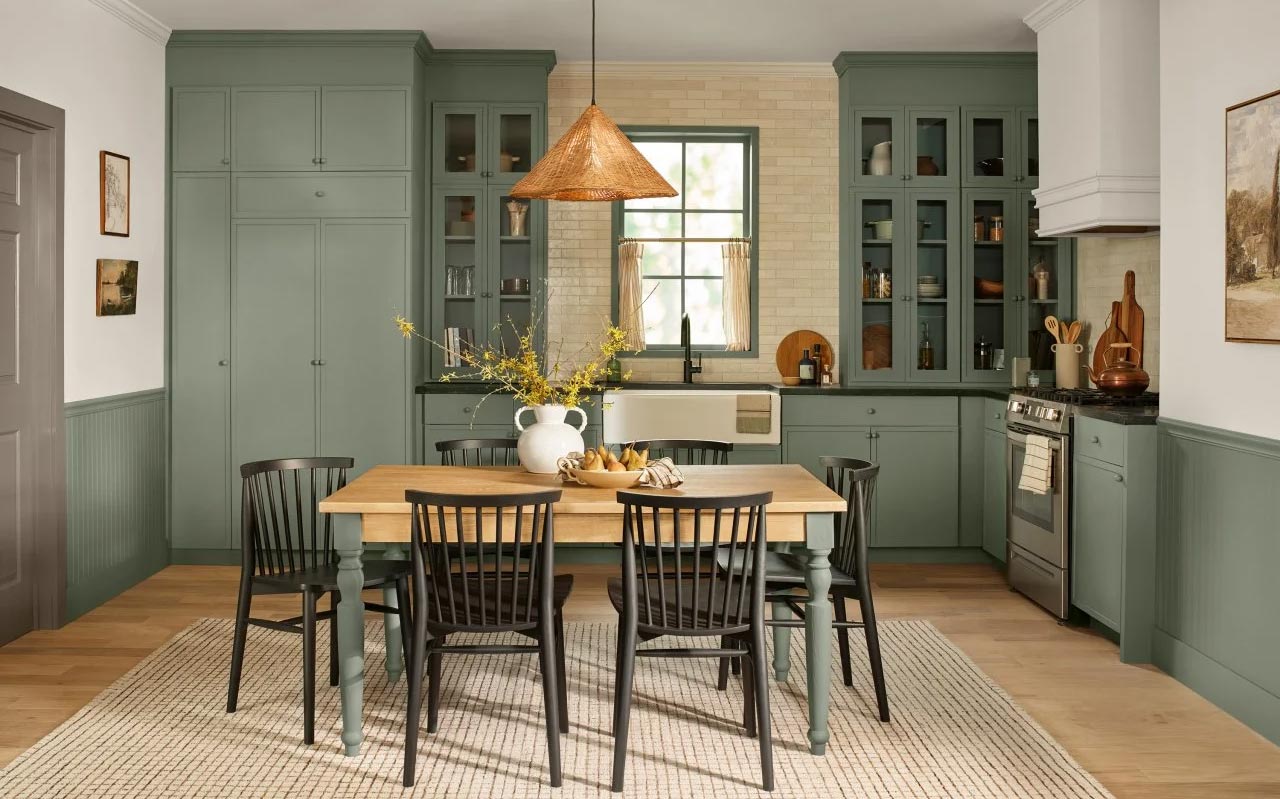
Valspar’s 2026 Color of the Year: Warm Eucalyptus – 8004-28F
Warm Eucalyptus is a soft, earthy green with a hint of gray — the kind of color that instantly relaxes a room. It’s subtle, adaptable, and easy to live with, which is why this family of greens has already been popular with many of our clients.
In kitchens and baths, it plays especially well with natural wood, soft whites, and warm metals. Think spa-like without being precious — a grounded green that feels timeless rather than trendy.
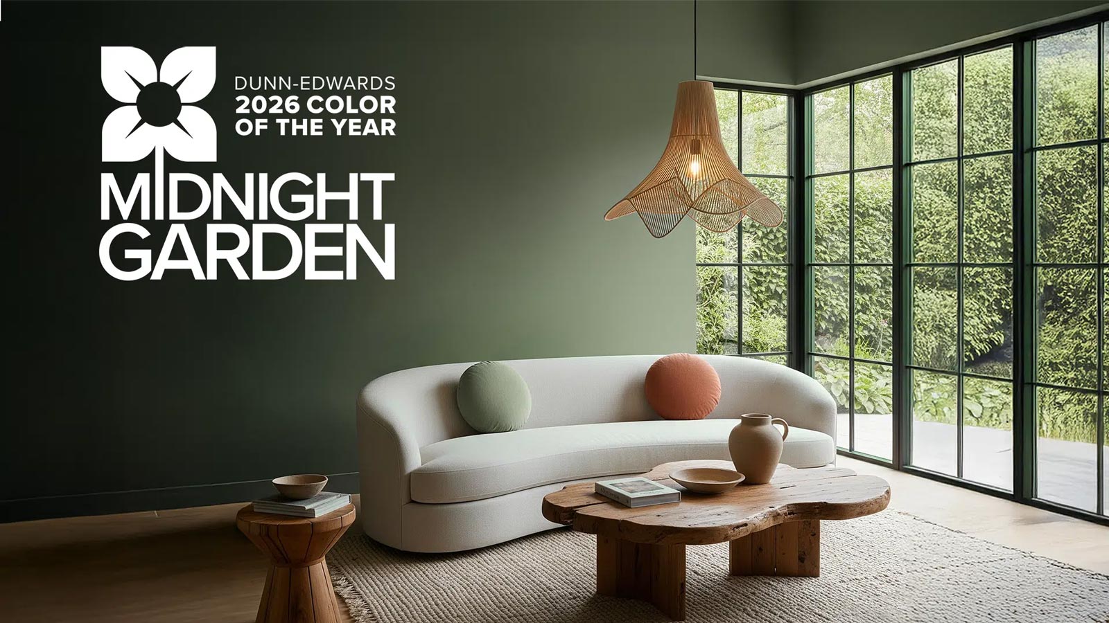
Dunn-Edwards’ 2026 Color of the Year: Midnight Garden DE5657
Midnight Garden (DE5657) is a deep, muted green grounded in earthy undertones — a shade that feels calm, sophisticated, and quietly connected to nature. Rather than shouting for attention, it brings a feeling of depth and balance, like the stillness of a garden at dusk.
Because of its muted richness, Midnight Garden works beautifully in many different contexts: cabinetry, accent walls, exterior siding — or anywhere you want a sense of grounded serenity. It pairs especially well with natural materials (wood, stone, linen) or warm neutrals and creates a backdrop that feels both timeless and restful.
For remodelers and homeowners looking for a green that doesn’t dominate but supports a mood — a sense of calm, rootedness, and understated elegance — Midnight Garden is a strong, versatile choice for 2026.
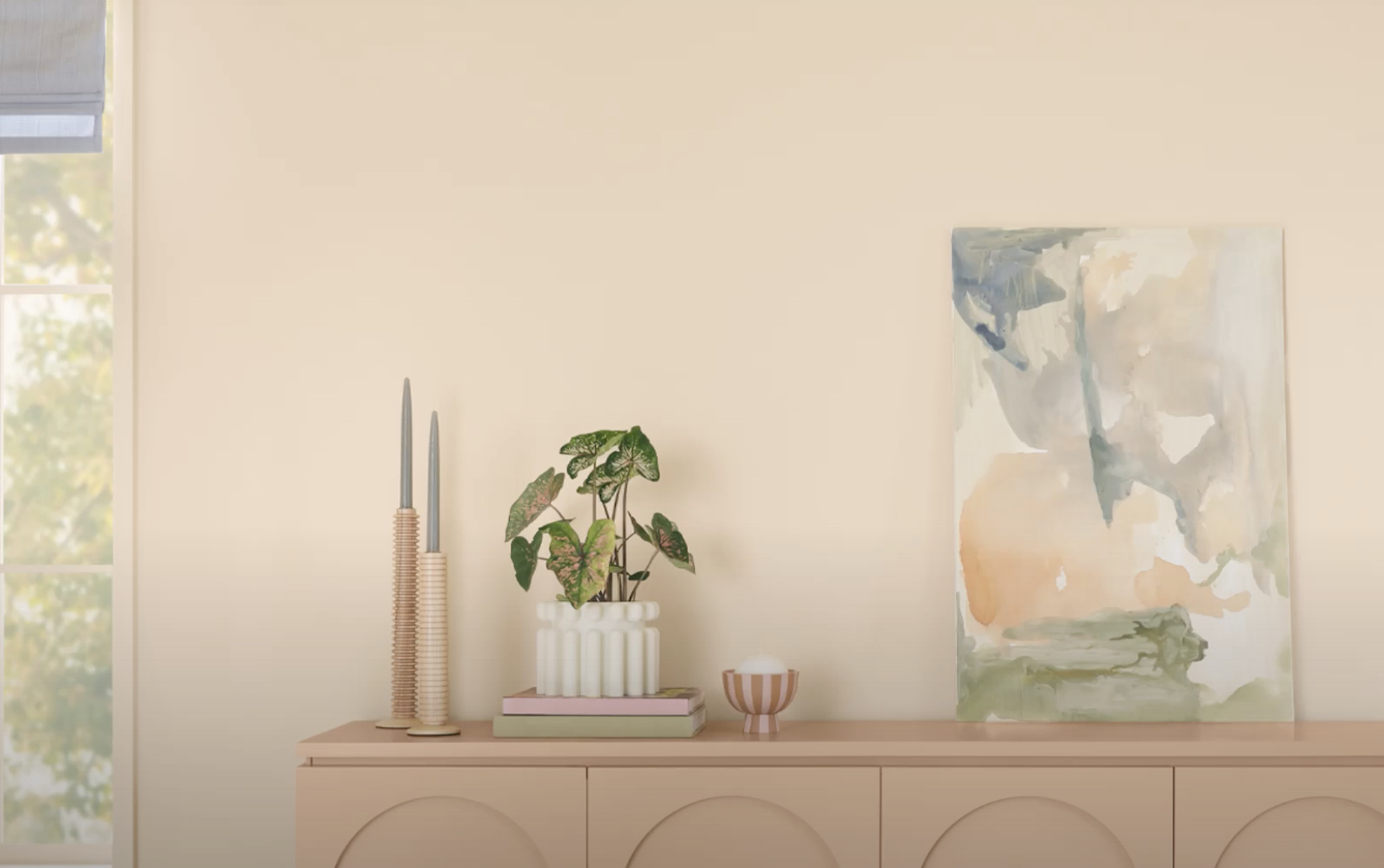
Dutch Boy’ 2026 Color of the Year: Melodious Ivory
Melodious Ivory is a warm, creamy off-white that leans gentle and welcoming. It’s the kind of hue that smooths out a space — bringing softness without reading yellow or heavy.
For homeowners who want a light palette but prefer something warmer than pure white, this shade adds quiet glow and approachability. It’s especially effective in living areas, hallways, and kitchens where a touch of warmth makes the space feel more lived-in.
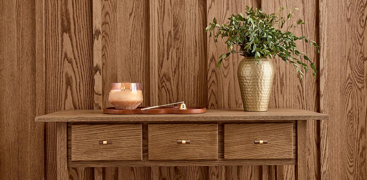
Minwax’ 2026 Stain Color of the Year: Special Walnut
Special Walnut is Minwax’s 2026 stain-of-the-year — a warm, deep wood tone that celebrates the natural beauty of grain and craftsmanship.
This stain adds richness and dimension to wood surfaces without overwhelming them, giving furniture, cabinetry, or trim a sense of history and warmth. Whether you’re refinishing a classic dining table or updating built-in shelving, Special Walnut enriches wood’s natural character while adding subtle sophistication.
Design-wise, it’s ideal if you want to lean into a wood-centric aesthetic — think walnut floors, stained interior doors, or vintage-inspired furniture — and build around it with light or natural-toned walls, soft fabrics, and muted accents for balance.

